5,079 search results (0.016 seconds)
  1. Advance by URW Type Foundry, $39.99
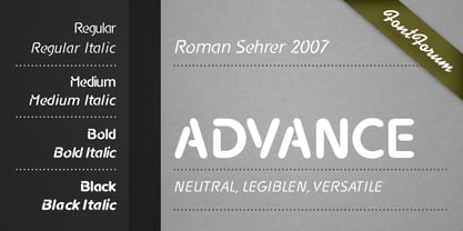
  2. Aspirin Advance by T-26, $19.00
  3. advent - Unknown license
  4. Aduana by Fabio Ares, $-
    Aduana is the first typographic product of argentine-chilean typographic archeology project called "Valpo. Ciudad de Letras" (Fabio Ares & Karin Thiers, since 2016). Based on the letter located on the front of the Customs building (Valparaíso, Chile). The resultant family can be described as display type and modern renaissance style, with geometric shapes and serif and mild line modulation. The proceeds from the sale of the fonts will be used to finance the project.
  5. Cadancy by Grafemars, $10.00
    Cadancy is a simple monoline typeface, designed with consistent line touches providing a subtle text feel, perfect for large and medium displays. has additional character and swash styles to enrich the look of your designs.
  6. Advent by Jonahfonts, $25.00
    A Semi-Slab face with a distinct emphasis on power and legibility. Very paced for packaging, posters, logos and various other applications.
  7. Advanced Pixel-7 - Personal use only
  8. FF Avance by FontFont, $65.99
    Dutch type designer Evert Bloemsma created this serif FontFont in 2000. The family contains 4 weights: Regular, Italic, Bold, and Bold Italic and is ideally suited for book text, editorial and publishing, small text as well as web and screen design. FF Avance provides advanced typographical support with features such as ligatures, small capitals, alternate characters, case-sensitive forms, fractions, and super- and subscript characters. It comes with a complete range of figure set options – oldstyle and lining figures, each in tabular and proportional widths.
  9. Adana by astype, $19.00
    The roots of Adana going back to the year 1930, to the Berlin-based German graphic designer Wilhelm Berg. His typeface can be interpreted as an answer to Lucian Bernhards Schönschrift. Adana Circular and Regular play well together in all kinds of adverts, as well with designs like Bodoni or Didot.
  10. Grachi 2 - Unknown license
  11. Adigiana 2 - Unknown license
  12. Corners 2 - Unknown license
  13. HOLE 2 - Unknown license
  14. Lastu # 2 - Unknown license
  15. Blade 2 - Unknown license
  16. Animals 2 - Unknown license
  17. Insert 2 - Unknown license
  18. KiddieClip 2 - Unknown license
  19. Kinex 2 - Unknown license
  20. Intergalaktika 2 - Unknown license
  21. 2 Lines - Personal use only
  22. Willy 2 - Personal use only
  23. dearJoe 2 - Unknown license
  24. Lizard 2 - Unknown license
  25. Zeppelin 2 - Unknown license
  26. Justinian 2 - Unknown license
  27. joeHand 2 - Unknown license
  28. PLATSCH 2 - Unknown license
  29. Kozmonauta 2 - Unknown license
  30. Helloween 2 - Unknown license
  31. GemBats 2 - Unknown license
  32. Justinian 2 - Unknown license
  33. Kometenmelodie 2 - Unknown license
  34. Writers 2 - Unknown license
  35. Untitled 2 - Unknown license
  36. Norseman 2 by Alphabet Agency, $21.00
    Forged to be as imposing as a Norse horde ready to stampede into battle, Works great in all caps which it was initially designed to. I designed the lowercase characters to match really well with each other and the uppercase, so it works well in title case. Designed by Jon Swinn.
  37. Collegeblock 2 by Sharkshock, $115.00
    The Collegeblock family is reminiscent of straight lined letter forms found on collegiate sweaters and in the sports world. This blocky display font features only angled lines with stubby serifs and available in 3 styles including 3D Extrude. The characters are more vertical in nature with a low contrast for high legibility. Many different languages are covered including Cyrillic. Use Collegeblock 2 for a t-shirt, logo, or web graphics.
  38. Grenale #2 by insigne, $24.00
    Grenale #2 shapes the new standard of elegance within the Grenale family. Not your typical sans, this pure, geometric structure with its glamorous sensitivity draws much inspiration still from Grenale's didone sans and the haute couture influence. Independently attractive, though, the form abandons the original's high contrast for its own minimal stroke variation, achieving proper balance through its graceful strokes. Grenale's thin weights are simple but vibrant--elegant forms that naturally lend themselves to designer journals and high-end branding along with upscale applications. With added energy and power, the thicker weights give your work a firmer, statlier look. Grenale #2's upright versions are also matched by optically adjusted italics. While unique in appearance, any of #2's weight also provide a well-matched companion to its original counterpart. The fashionable typeface includes a multitude of alternates that may be accessed in any OpenType-enabled application. The stylish features include a large group of alternates, swashes, and meticulously refined details with ball terminals and alternate titling caps to accessorize the font. Also included are capital swash alternates, old style figures, and small caps. Peruse the PDF brochure to see these features in action. OpenType enabled applications such as the Adobe suite or Quark can take full advantage of the automatic replacing ligatures and alternates. This family also offers the glyphs to support a wide range of languages. It's time to think high-class. Graceful and assured, the carefully crafted forms of Grenale #2 step pleasantly onto each page with elegant charm. Include its range of alternate glyphs, and this chic font is a superb choice for bringing a far more refined look to your projects.
  39. Coranto 2 by TypeTogether, $49.00
    Now available as Opentype font with extended character set, Coranto 2. It is originally based on Unger’s typeface Paradox, and arose from a desire to transfer the elegance and refinement of that type to newsprint. Coranto 2 has a larger x-height and in many places has been made more robust. Over the past 25 years newspaper production has seen spectacular improvements in paper and print quality, the introduction of colour printing, and vastly better register. Newspaper production still demands a lot of letter forms, but advanced printing brings out details better and makes typography more appealing to readers. For text type the newspaper is no longer an environment in which survival is the chief assignment. Today, newspapers are not merely a matter of cheap grey paper, thin ink and super-fast rotary printing, and type design no longer has to focus on surviving the mechanical technology and providing elementary legibility. Now there is also room to create an ambience, to give a paper a clearer identity of its own; there is scope for precision and refinement. One consequence of this is that newspaper designers can now look beyond the traditional group of newsfaces. Conversely, a newsface can be used outside the newspaper — not an uncommon occurrence. The update to this beautiful font family, Coranto 2, includes the addition of over 250 glyphs featuring full Latin A language support, new ligatures, 4 sets of numerals, arbitrary fractions and superiors/inferiors. Furthermore, kerning was added and fine tuned for better performance.
Looking for more fonts? Check out our New, Sans, Script, Handwriting fonts or Categories
abstract fontscontact usprivacy policyweb font generator
Processing